
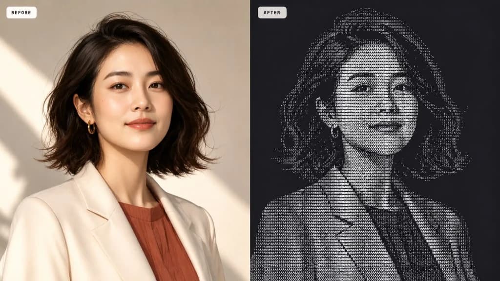
Most “image to ASCII” tools are doing the same quiet shortcut
Search for an image to ASCII converter and you will find dozens of free tools that feel interchangeable: drop a photo, pick a character set, drag a detail slider, export a PNG. Under the hood, most of them still use the oldest idea in text art—measure how bright each cell is, then pick a character from a density ramp such as `@#S08Xx+=-;:,.`
That method is fast and honest about what it is. It is also why so many results look soft, blotchy, or “almost a face.” Average brightness cannot tell a sharp cheekbone from a flat shadow, or a diagonal strand of hair from noise. If two characters have similar ink weight, the converter has no reason to prefer the one that actually looks like an edge.
If your goal is a GitHub README banner, a Discord avatar, a print-ready poster, or a photo that still reads as a person at arm’s length, you need more than a brightness lookup. You need the converter to care about shape.
What image-to-ASCII conversion is actually doing
ASCII art is a picture rebuilt from printable characters. The converter divides your image into a grid. Each cell becomes one glyph. Darker regions usually get denser characters; lighter regions get sparse ones or spaces. Line those glyphs up in a monospace font and the original subject reappears—drawn entirely in type.
The quality of that grid depends on three decisions: how finely you sample the image (columns), which character vocabulary you allow, and how you choose the “best” glyph for each cell. Most online converters only optimize the first two. The third decision—the matching rule—is where results diverge.
A useful mental model: brightness mapping asks “how dark is this patch?” Structure-aware matching asks “what does this patch look like, and which real character shape fits it?” Both still run locally in a modern browser. The difference is what information survives the trip from pixels to text.
- Brightness ramps are a one-number summary of each cell.
- Structure-aware matchers compare a small light field inside the cell to calibrated glyph shapes.
- Export quality only matters after the matching rule has already decided the grid.
Why structure-aware glyph matching looks sharper
PiPiPix’s free image to ASCII tool calibrates characters in the same monospace font used for the final render. Each glyph is measured as a compact light field—not just a single density score—so the engine knows whether a character is heavy on the left, empty in the center, or strong along a diagonal.
When your photo is sampled, every cell is analyzed the same way. The matcher then scores candidates with both tone error and shape error. High-variance cells (edges, eyelashes, letterforms in a logo) lean harder on shape. Smooth regions lean on tone. That adaptive balance is what keeps contours readable without turning soft gradients into spaghetti.
You can steer the same engine with three renderers. Smart balances structure and tone for most photos. Structure pushes directional glyphs when silhouettes and hair matter. Tone relaxes shape pressure for photographic shading—useful for skies, fabric, or soft portrait lighting. None of this requires uploading your file; the conversion stays on your device.
- Glyphs are calibrated in the output font, so preview and PNG stay faithful to the same grid.
- Smart / Structure / Tone change the matching emphasis without changing your character set.
- This is a category difference from brightness-only converters—not a skin on the same ramp.
Start with a source that can survive becoming text
ASCII art punishes busy, low-contrast photos. Before you touch any slider, pick an image with one clear subject, a readable silhouette, and enough separation from the background. Tight crops beat wide environmental shots. Faces, products, logos, and animals usually convert better than cluttered street scenes.
If the first result looks muddy, resist the urge to only raise resolution. First ask whether the subject is large enough in frame, whether the background is competing, and whether invert would better match a light-on-dark or dark-on-light source. A cleaner crop often improves the art more than twenty extra columns.
- Prefer moderate-to-strong contrast over flat lighting.
- Remove tiny text that cannot survive as a few glyphs.
- Square or near-square crops help social avatars and demo comparisons.
Parameter guide: what each control is really for
The controls in an image to ASCII studio look technical, but each one answers a specific visual question. Use this as a field manual rather than turning every dial at once.
- Renderer — Smart for general photos; Structure for edges and hair; Tone for soft gradients and photographic fill.
- Character set — Classic for readable ramps; Detailed for fine gradients; Lines for directional energy; Blocks for bold poster density; Minimal for high-contrast graphic looks; custom characters when you want a branded vocabulary.
- Columns — The main “detail” control. Start mid-range, then raise only until important features stabilize. Too many columns can make the result look noisy instead of clearer.
- Exposure / Contrast / Gamma — Pre-shape the light field before matching. Lift underexposed faces with exposure; add separation with contrast; use gamma when midtones feel crushed or washed out.
- Edge influence — How aggressively high-variance cells prefer shape-fitting glyphs. Raise it for logos and hair; lower it if the image becomes brittle.
- Error diffusion (dither) — Spreads tone error across neighbors for smoother shading. Helpful for skin and skies; turn off for hard graphic marks.
- Invert — Swaps the density mapping. Essential when a dark photo on a light background (or the reverse) reads “inside out.”
- Sample source color — Keeps local color on glyphs for vivid PNGs; turn off for classic mono terminal aesthetics.
- Background — Dark, light, or transparent changes how density is interpreted and how the PNG composites.
- Export scale — Integer scales (1×–4×) enlarge the same glyph grid for posters and social without inventing new detail.
Image to ASCII art vs pixel art
Both techniques simplify an image into a grid, but they answer different jobs. ASCII art fills each cell with a text character, so the result can be copied into a terminal, a code comment, or a chat message. Pixel art fills each cell with a solid color block and lives as an image asset for games, stickers, and UI.
If you need pasteable text or a typographic aesthetic, stay on the image to ASCII path. If you need palette-limited sprites or icon grids, use an image-to-pixel-art converter instead—and keep the workflows separate rather than forcing one medium to imitate the other.
Free, private, and ready when the matching is right
A strong image to ASCII result is less about collecting features and more about preserving structure through the glyph decision. Once the face, logo, or product edge reads cleanly in the preview, export. The PiPiPix converter runs entirely in your browser: no account for the free tool, no upload of the source image, and PNG or copied text when you are done.
Open the tool, drop a high-contrast subject, and compare the live preview against the original. When the silhouette holds, you are finished—not when every slider has been touched.