
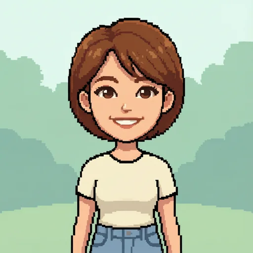
Start with an image that has a readable silhouette
The fastest way to make better pixel art is to begin with a source that still makes sense when viewed small. A clear subject, simple background, and visible separation between the subject and its surroundings give the converter useful structure to preserve.
Crop away empty space before converting. For portraits and avatars, keep the face large enough to survive downsampling. For objects, choose an angle with a distinctive outline rather than relying on small surface details.
- Choose one obvious focal subject.
- Prefer moderate contrast over flat lighting.
- Remove tiny text and details that cannot survive at low resolution.
Choose block size before chasing color
Block size controls the visual vocabulary of the result. Larger blocks create a bolder, more icon-like image; smaller blocks preserve more detail but can look like a filtered photo instead of intentional pixel art.
Begin around the middle of the block-size range. Increase it until the silhouette feels decisive, then move back one step if an important feature disappears. Judge the image at its intended display size, not only while zoomed in.
Limit the palette deliberately
A reduced palette creates cohesion. Automatic Lab palettes are a strong starting point because they group colors by perceptual similarity, but fewer colors often produce a more authored retro look.
Use a preset palette when the destination already has a visual system, such as a game UI or a coordinated avatar set. Use an automatic palette when preserving the source image's identity matters more than matching a particular era.
- Use fewer colors for icons and small sprites.
- Keep more colors for portraits and illustrated scenes.
- Check that the subject and background do not collapse into the same value range.
Use dithering only when it solves a problem
Dithering simulates intermediate tones by arranging neighboring pixels. It can smooth gradients and add texture, but it also introduces visual noise. Turn it off first, then compare Floyd–Steinberg or Atkinson only when skies, shadows, or skin transitions feel too abrupt.
For clean interface icons, logos, and readable sprites, no dithering is often best. For atmospheric scenes, limited dithering can make a small palette feel richer without adding colors.
Compare at 100% and export with nearest-neighbor scale
Inspect the result at its native pixel dimensions before export. Check the eyes, hands, outer silhouette, and any thin diagonal edge. If a feature looks muddy, adjust the block size or palette before increasing export resolution.
Export at an integer scale such as 4× or 8× so every source pixel becomes a crisp square. PNG is the safest choice for transparency and broad compatibility; SVG is useful when a workflow needs scalable grid geometry, while JSON preserves palette and cell data for custom pipelines.
When to use an AI pixel art generator instead
An image converter is best when you already have a composition, portrait, product, or illustration to preserve. An AI pixel art generator is better when you want a new sprite, icon, character, or scene from a written idea.
A practical workflow can use both: generate a concept first, then run the selected output through the converter to impose a tighter palette, controlled dithering, and a consistent export grid.